A problem well stated is a problem half solved.

— Charles Kettering

Six years of product design across enterprise SaaS, consumer apps, and AI powered tools. This walkthrough covers my design process, how AI fits into every stage of it, and two case studies that show both in practice.

Portrait of Nick Newhart
Presentation byNick Newhart
0
Years in design
0
Years running my own studio
0+
User interviews conducted
0
Shipped AI products
How I Work

My process starts with understanding the problem before designing anything.

Every project follows the same arc regardless of complexity. Understanding before designing. Structure before pixels. Shipping before perfecting. One thing I always do before I start is ask myself if I could explain this problem to my mom or dad. Not a simplified version of it, the actual problem. If I cannot do that in plain language it usually means I do not fully understand it yet, or the problem statement is still too vague to design from. That check keeps me honest before I touch anything.

  1. Problem Framing

    Before anything gets designed I need to understand what we are actually solving. I talk to stakeholders, look at existing data, and try to articulate the problem in one clear sentence. If I cannot do that the design will not hold together.

  2. User Research

    I talk to real users before I touch a single screen. At LiveBy that meant 100 plus agent interviews. For roam. it meant usability testing after launch. Research is not a phase, it is the foundation every decision gets built on.

  3. Information Architecture

    Once I understand the problem and the users I map out how the product should be organized. Who goes where, what they can see, how they move through the system. For complex products like LiveBy this step saved months of rework later.

  4. Design System

    I build or align to a design system before I start designing features. It is infrastructure for the whole team, not just a designer's asset library. Every component I create from this point forward gets built from it, not around it.

  5. Prototyping

    I prototype to think, not to present. With Lovable I can go from idea to clickable prototype in hours. Getting something real in front of engineers and stakeholders early changes the conversation completely. You are reacting to something instead of imagining it.

  6. Ship

    Shipping is not the end of the design process. It is where you find out if your decisions were right. I stay involved through implementation, do design QA after launch, and treat the shipped product as the starting point for the next iteration.

  7. Iterate

    Real user behavior in production tells you more than any prototype. I watch how people actually use the product, identify where they drop off or get confused, and iterate based on evidence from Maze, analytics, support tickets, wherever the signal is.

AI Workflow

Where AI fits in my workflow.

Over the last year I have rebuilt how I work around AI at every stage of the design process. Not to cut corners, but to spend more time on the decisions that actually matter. Here is the stack and where each tool lives.

Claude

Strategy and Thinking

My primary thinking partner. I use Claude to pressure test problem framing, map information architecture, cross reference user interview notes, and find pain points across multiple sessions. What used to take days in Miro now takes hours of conversation.

Lovable

Prototyping and Shipping

I go from idea to clickable interactive prototype in hours, not days. Lovable lets me get something real in front of a PM or engineer the same day I have the concept. Engineers can also pull code directly from Lovable into their codebase. roam. was built and shipped entirely in Lovable in 14 days.

Figma Make

Component Generation

For quick component generation and mocks that transfer cleanly into Figma files. Speeds up the handoff between concept and high fidelity design without rebuilding from scratch.

Gemini

Research Synthesis

I use Gemini to take notes during user interviews so I can focus on listening rather than capturing. After 10 to 20 interviews I cross reference all transcripts in Claude to surface the most common pain points, themes, and priority order. Research synthesis that used to take a week now takes an afternoon.

Cursor

Code editing and refinement

An AI powered code editor I have been exploring for cases where I need more direct control over the codebase than Lovable allows. Where Lovable is great for getting an idea working fast, Cursor lets me go into the actual code and adjust it precisely. Useful for refining roam. and for working inside existing codebases without needing a developer.

ChatGPT

Image generation and visual reference

I use ChatGPT image generation to create contextually accurate placeholder imagery for mockups, explore visual directions quickly before committing to a design, and generate mood board references when establishing a new visual language. It replaces hours of stock photo searching with imagery that actually fits the context of the specific product and use case.

"Using these tools has meaningfully compressed how long it takes to get from an idea to something testable. That has changed how I prototype and how quickly I can validate a direction."
Case Study 01

LiveBy Platform and LiveBy Local

A B2B SaaS platform helping real estate agents explore neighborhoods, generate market reports, and share hyperlocal insights with clients.

B2B SaaSDesign SystemsUser ResearchEnterprise
0
Disconnected tools unified
0+
Agent interviews
0%
Faster report generation
0
User roles designed

The Problem

LiveBy had six separate tools for neighborhood data, walk scores, demographics, market trends, school ratings, and more. Agents had to jump between all six to build a single client report. The process took 15 to 20 minutes. Reports looked different every time. Nothing was connected.

Before
6 tools · 15–20 min per report
Agent
MLS Search
School Data Portal
Walk Score
Demographics
Market Trends
LiveBy Local Search
Manually copy & assemble report
Inconsistent branding · variable quality

The Pushback Moment

When I joined, the team wanted to start building immediately. They had stakeholder alignment and a rough direction. As the new designer I had to make a leadership call. I pushed back. We needed an information architecture diagram, a design system, and a clear roles and permissions model before touching Figma. That conversation was uncomfortable being new, but it was the right call. When we added the second and third product to the suite later, we were not rebuilding anything from scratch.

Platform IA
Mapped before any UI
Access
Sign in
Magic link
Returning user
Session restored
Onboarding
Plan · profile · brokerage
Roles
Owner
Everything
Admin
Team & brand
Agent
Tools
Product Suite
LiveBy Local
Neighborhood
Market Explorer
Market Data Pro
Core Flow
Search area
Neighborhood page
Generate report
Deliver
Share link
Branded PDF
Embed widget
Client receives report

Research First

Before designing anything I established a dedicated research cadence. Every Thursday was blocked entirely for user interviews and feedback. If no interview was scheduled that day my job was to go through existing notes and craft user stories from what I had already heard. No designing on Thursdays. Just listening and synthesizing. That structure meant user feedback was a continuous input into the design process, not a one-time discovery phase. The most important thing that came out of it: agents think in neighborhoods, not in data tables. The original LiveBy Local was a search bar. That was wrong. We pivoted to a map first experience where agents click on geographic tiles to explore and generate reports. That insight came from a Thursday, not from a stakeholder meeting.

Interview themes
Mentions across agent interviews
Data accuracy issues
Report customization
AI feature interest
Navigation friction
Integration requests
Mobile & print improvements
012345678
Number of agents
Interview themes

The Design System

There was no design system when I arrived. I built one from scratch before designing a single feature. Color tokens, typography scale, spacing system, shadow levels, component library with full states and documentation. The governance model was the part most people skip. New features got built from the system, not around it. When we decide to add Market Explorer and Pages to the product suite, the foundation will already be there.

LiveBy · Core LibraryFoundations / Color
100%
Color / Primary ramp520 × 240
50#EEF4FF
100#E0EAFF
200#C7D7FE
300#A4BCFD
400#8098F9
500#6172F3
600#444CE7
700#3538CD
800#2D31A6
900#2D3282
color.primary.[50–900]10 styles · published
Color / Semantic roles360 × 240
Accent / Tealbrand secondary, agent tier#15B79E
Successpositive market delta#12B76A
Warningstale data flag#F79009
Errorvalidation, failed sync#F04438
Inkbody copy#101323
Ink / Mutedlabels, captions#5D6B98
Contrast / Checks520 × 120
Neighborhood
600 on white · 7.1 AAA
Neighborhood
white on 600 · 7.1 AAA
Neighborhood
ink on 50 · 16.4 AAA
Applied / Surface360 × 120
LiveBy Local
Dark surface uses 900
PrimaryAccent
One indigo ramp plus six semantic roles. Every surface pulls from a token, never a hex.Color / Primary 600 selected
Color foundations

Roles and Permissions

The platform serves three user types simultaneously. Owners see everything and control top level settings. Admins manage their agents, configure branding, and assign roles. Agents access the tools they need with branding already applied automatically. Early beta testing showed admins were assigning roles without understanding what those roles allowed. We moved the permissions map earlier in onboarding and made it visual rather than text based. That single change resolved a category of support tickets entirely.

Roles and permissions
3 tiers · inherited model
Owner
  • Full platform access
  • Manage all admins
  • Billing and subscription
  • Brand master control
  • API configuration
  • Plan and package rules
  • All reports and analytics
Admin
  • Manage brokerage agents
  • Configure branding
  • Assign and revoke roles
  • View agent activity
  • Report history access
  • No billing access
  • No cross-brokerage access
Agent
  • Access LiveBy Local
  • Generate and share reports
  • View own activity
  • Branding auto-inherited
  • No admin settings
  • Cannot manage users
  • No billing or API access

The Outcome

Agents generated reports 40 percent faster in beta. What previously required 15 to 20 minutes across six tools now takes under 9 minutes on a single surface with automatic brokerage branding. Enterprise clients including Sotheby's International Realty and Berkshire Hathaway HomeServices adopted the platform as their primary tool. The design system scaled to support three additional products without a rebuild.

Map first interface
Neighborhood tiles, not a search bar
Early flag caught

During beta testing we discovered that agents across the same brokerage were producing reports with completely different branding. Some had the right logo, some had outdated colors, some had no branding at all. The root cause was that branding was being configured manually at the agent level with no inheritance from the brokerage admin. Left unchecked this would have created a serious trust and consistency problem for enterprise clients like Sotheby's where brand standards are non-negotiable. We caught it before full rollout and redesigned the branding model so configuration happens once at the admin level and inherits automatically down to every agent and every report. Zero manual effort required at the agent level from that point forward.

What I would do differently

I would have pushed for more structured field research earlier. Watching agents use the product in their actual environment between showings would have surfaced the less noise insight faster than interview sessions alone. Some of the data density we simplified later could have been caught sooner.

Case Study 02

roam.

An AI powered travel app built solo in 14 days, from idea to deployed product with active users.

AI Product DesignConsumer MobileNon-deterministic UXClaude API
0
Days from idea to deployed
0
6 Discoveries unique to AI product design
0
AI models integrated (Claude Sonnet, Claude Haiku, Gemini)
0
Surfaces built (app, landing page, admin dashboard)

The Origin

Two real trips sparked the idea. A solo trip to Switzerland where local knowledge and AI synthesis created an extraordinary experience. And a trip to Rome with my girlfriend where an ankle injury meant every stop had to be close to the next and worth the walk. The hours spent cross referencing maps and guessing became the product. What if you could describe a trip in one sentence and get back a real hyper local itinerary in seconds?

But roam. was also an experiment. I wanted to know how fast I could take an idea from concept to a fully deployed product using AI, not a landing page or a prototype, but a real working app with a live API, authenticated users, an admin dashboard, and usability testing. All of it. Fourteen days was the answer. That changed how I think about what a designer can build on their own.

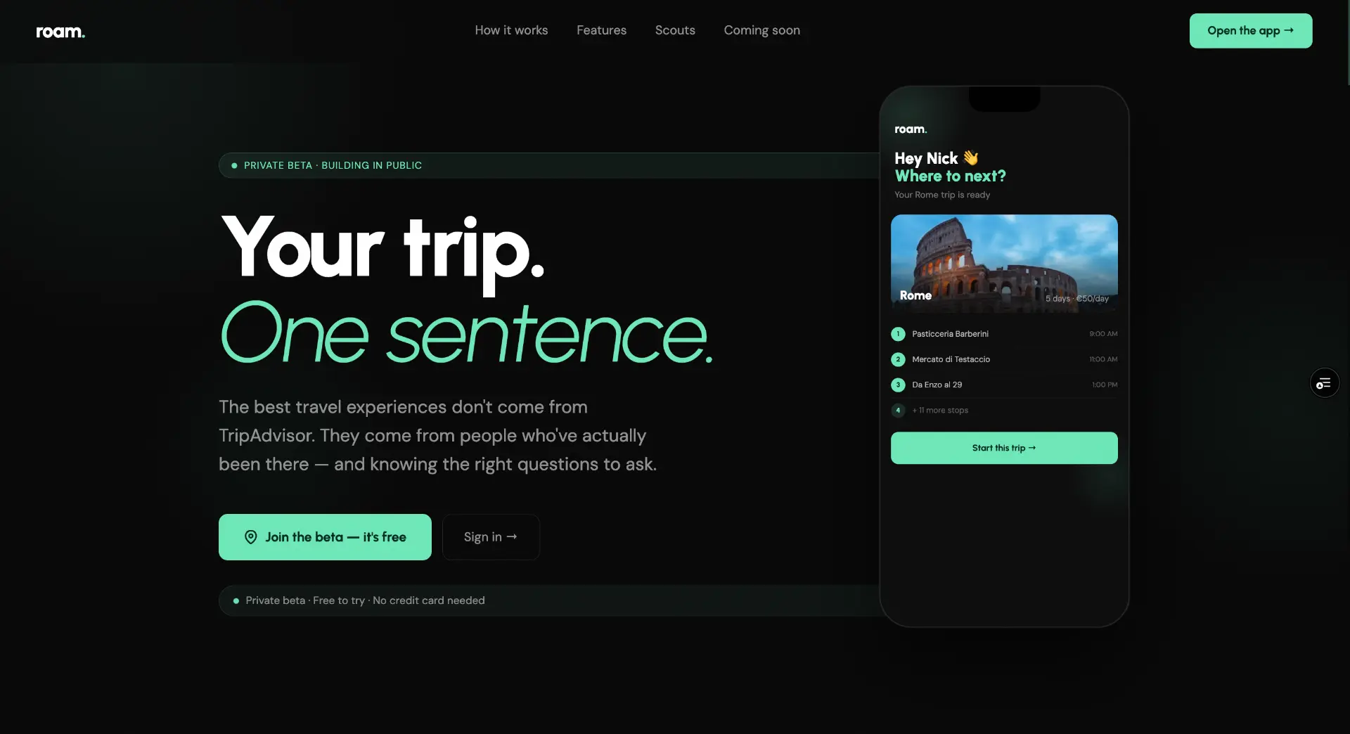
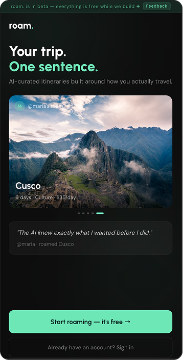
roam. landing page hero
roam. intro sign-up screen

The Design Challenge

Designing around AI outputs is completely different from designing a regular product. The Claude API generates different itineraries every time based on the same input. You cannot design every possible state because you do not know what every possible state looks like. That forced me to think about three specific problems I had never had to solve before: trust, correction, and failure.

Trust

How does the user know the AI got it right when they cannot verify it themselves.

Correction

When the AI gets something wrong the fix has to feel natural and low friction, or users stop trusting the system entirely.

Failure

When the AI cannot produce anything useful the experience has to maintain confidence. A blank screen destroys trust immediately.

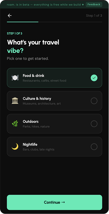
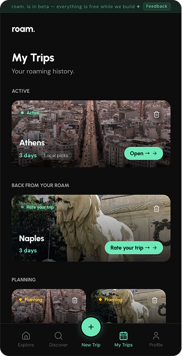
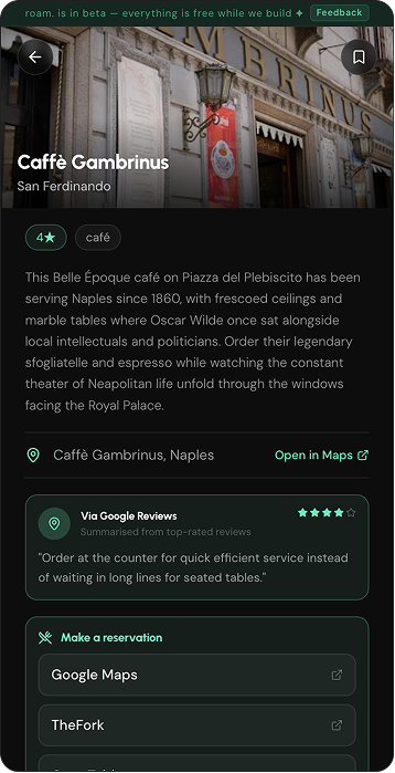
roam. travel vibe quiz screenroam. My Trips screenroam. stop detail screen

Six discoveries that changed the product

01

The 45 second generation problem

Problem: Sequential API calls made generation painfully slow.

Fix: Two phase generation returns trip stops in 15 seconds while photos and geocoding enrich in the background via Supabase Realtime.

02

All trips saving under one user

Problem: Every trip across all users was saving under a shared demo user ID.

Fix: RLS policies, real auth header extraction, session token passing, and a separate table for community versus private content.

03

The pace slider took 60 seconds

Problem: Changing stops per day triggered a full Claude Sonnet regeneration.

Fix: Claude Haiku for pace changes, debounced slider, explicit stop count validation, skeleton cards shown immediately.

04

The TheFork linking problem

Problem: Reservation links were opening the wrong restaurant in the wrong country.

Fix: Google Maps search as primary link using full name plus city plus country in the query.

05

Map pin failures

Problem: OpenStreetMap geocoder struggled with venue names in non English cities.

Fix: Switched to Google Maps Geocoder with a three level fallback chain.

06

Authenticity beats polish at beta

Problem: Placeholder testimonials were immediately flagged as fake by beta testers.

Fix: Replaced with Built in public, tested by real travellers which landed far better.

The Build Stack

Claude Sonnet API for trip generation. Claude Haiku for faster pace changes at one third the cost. Google Maps and Places for photos, geocoding, and distance matrix. Supabase for database, auth, and realtime. Vercel for deployment. Lovable as the development platform. Stripe for subscriptions paused in beta. Resend for transactional email.

Frontend
React
TypeScript
Tailwind
CSS
Lovable
Dev platform
Vercel
Deployment
Backend and data
Supabase
Postgres + Auth
Edge Functions
Serverless
Realtime
Live updates
Resend
Transactional email
AI layer
Claude Sonnet
Full trip generation · deep reasoning
Claude Haiku
Pace changes · 5x faster · lower cost
External APIs
Google Maps
Geocoding + distance
Google Places
Photos + search
Stripe
Subscriptions

Stack decisions and what they taught me

Claude Sonnet for generation, Claude Haiku for adjustments

Sonnet handled everything at first, even tiny slider edits.

Regenerating a whole trip for a minor edit took 60 seconds and cost 3x more than needed. Switching to Haiku for small adjustments cut cost and time.

Supabase over a traditional backend

Realtime UI updates were needed during background enrichment.

Supabase Realtime pushed updates live without polling or custom websockets. The architecture served the UX, not the other way around.

Lovable as the development platform

14 days from idea to deployed product.

Lovable removed setup friction so I could focus on design and AI behavior instead of configuration.

Vercel for deployment

The feedback loop had to match the build speed.

Deploys on every commit meant changes were live in minutes. Vercel kept that loop tight throughout the build.

Google Maps over OpenStreetMap

OpenStreetMap was free, but unreliable.

Nominatim failed on non-English venue names. Google Maps with a fallback chain fixed geocoding completely.

Two models, two phases, one product

The most important architectural lesson.

AI products must be designed around AI constraints: slow generation, non-determinism, and scaling costs. Every roam. decision came from accepting those limits.

The Admin Dashboard

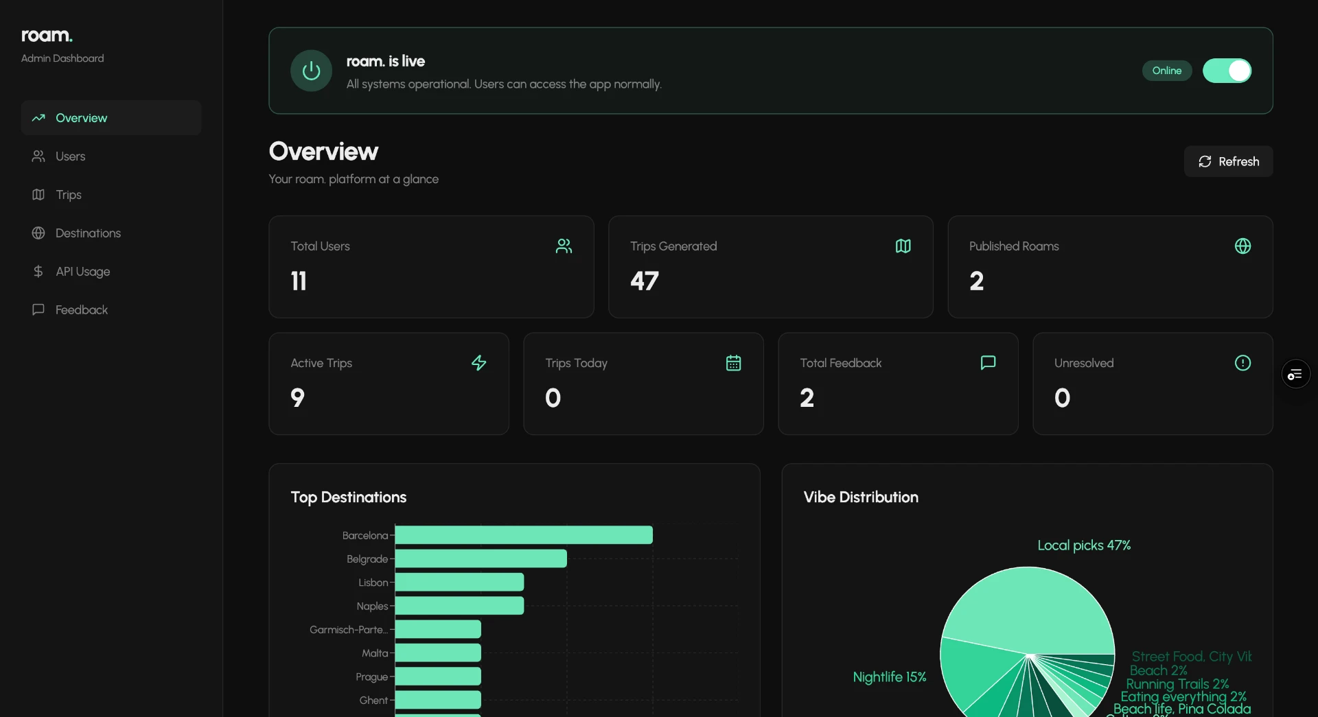
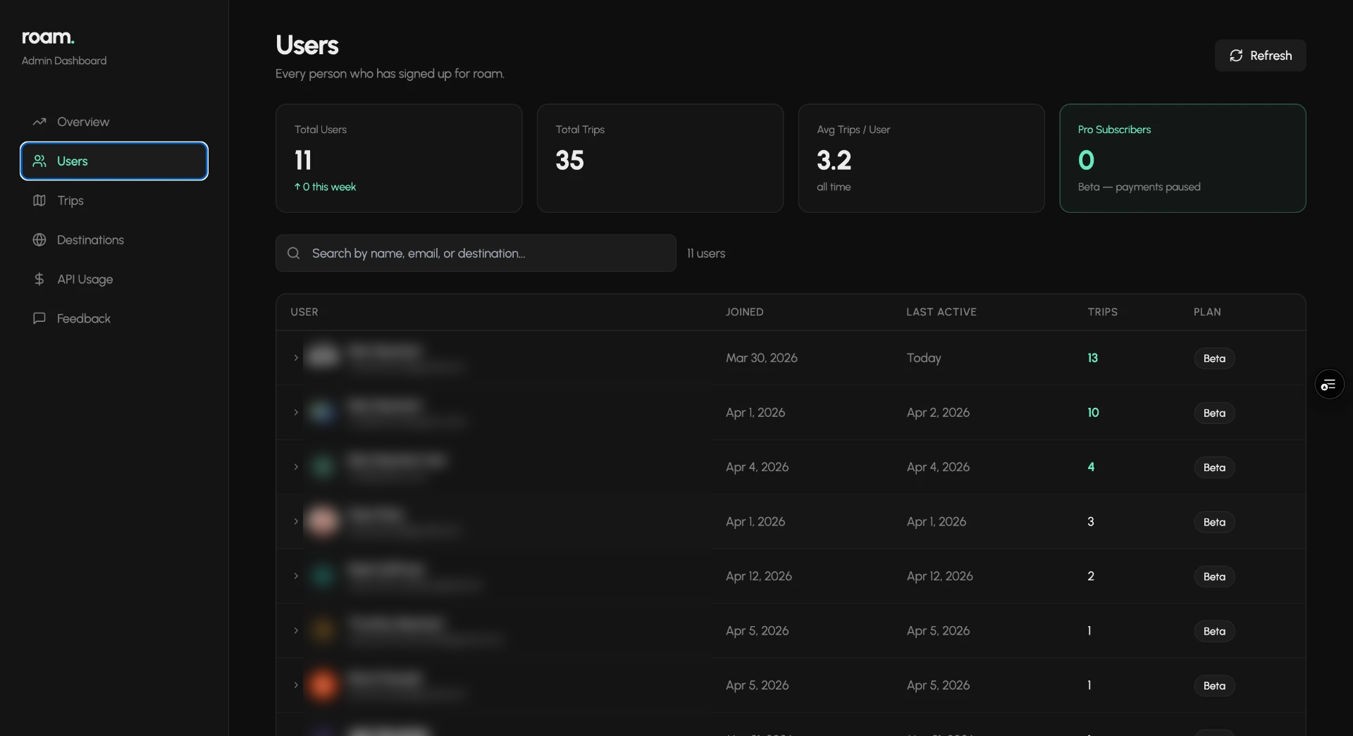
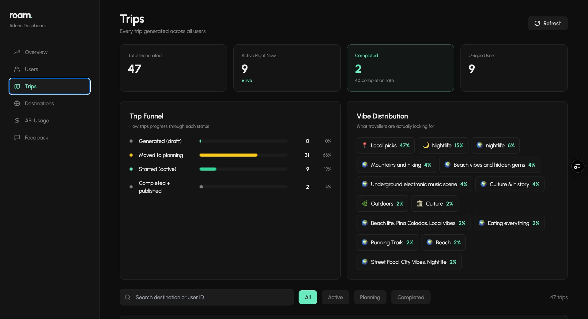
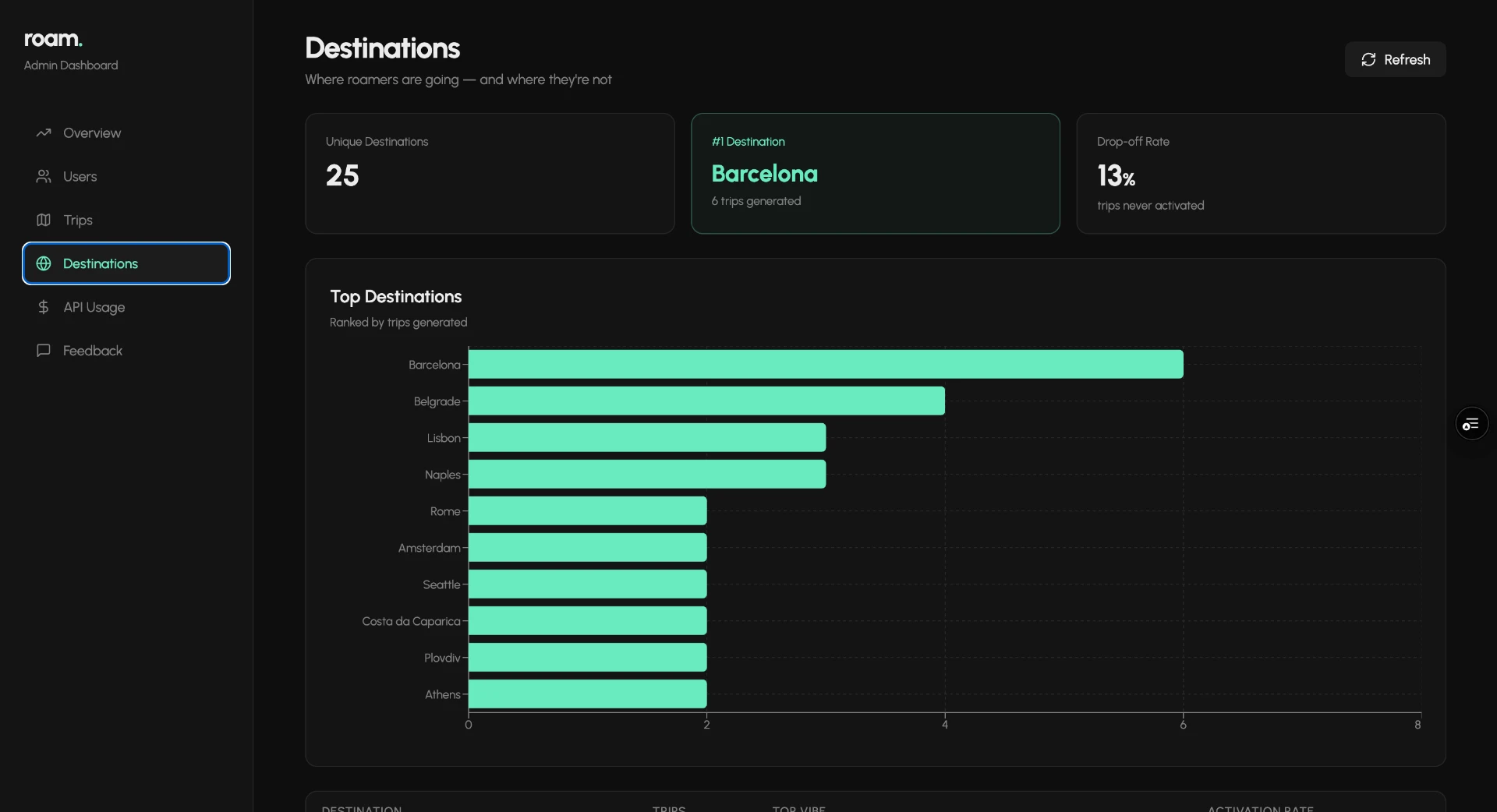
A separate Lovable project connected to the same Supabase database via service role key. Built to track active users, trips generated, top destinations, API cost per call, and beta feedback.

For popular destinations like Rome or Tokyo the model draws on rich location specific data and results feel genuinely local. For Dublin and LA outputs skewed toward obvious tourist staples. Users lost confidence in the AI and left. A prompt engineering problem, not a UX problem.

roam. admin dashboard overview screenroam. admin dashboard users screenroam. admin dashboard trips screenroam. admin dashboard destinations screen
Overview

What I Learned

Speed of building has permanently changed. roam. went from idea to live product in 14 days. The stack removed every traditional bottleneck. What previously required a founding team, seed funding, and six months now requires one person and two weeks of focused work. But even moving fast, the decisions that mattered most were structural. RLS policies, two phase generation, separate tables for community versus private content. Speed does not excuse shortcuts on data architecture.

roam. app screens
roam. app screens

What I would do differently

I would have set up proper analytics instrumentation from day one rather than building the admin dashboard after the fact. Knowing drop off rates by city earlier would have shaped the AI prompting decisions sooner and saved iteration time after launch.

The app is live. Feel free to try it.

Live product. Fully interactive.

Thanks for taking the time to go through this.

I am looking for a role where design craft, product thinking, and AI fluency all matter. Jump is designing the interfaces that help financial advisors trust and work alongside AI. The trust, correction, and failure problems I described in roam. are the same problems at the core of what Jump is building. That is exactly where I want to be.

Nick Newhart
Senior Product Designer